Last semester I gave to my students at Prague college a task to create corporate identity for a fashion brand. With previous experience of creating small visual identity only, for most of them this was their first broader project of such kind. As a designer I believe that corporate identities shouldn't be only functionally and aesthetically correct but should also carry deeper thought and be built on an interesting idea. My students' works shown below reflect this attitude. In some of them I love certain details, in some the complex approach, in others it is the way they look like - extraordinary, fighting nowadays trend of boring logotypes that all tend to look the same.
From the brief
The brand, called Love is the way up (or Litwu as they like to use) is a start-up company being shielded by its own fashion designer Marcela Krizova, and hence it provides and keeps its own style and taste. The company aims for smart, independent female audience between 30 - 50 years, with love towards high quality, design, attention to detail but appreciating minimalism at the same time. Litwu likes to give their customers a dress suitable for any occasion, be it a business meeting, dinner with the beloved ones or a friend's vernissage. Love is the way up is a paraphrase of Platonic love and life experience. It is a path in the life of a woman to herself. A path of finding and expressing her physical and mental uniqueness through her clothes and high quality design. It is a path towards love. And love is the way up.Pictogram out of typography
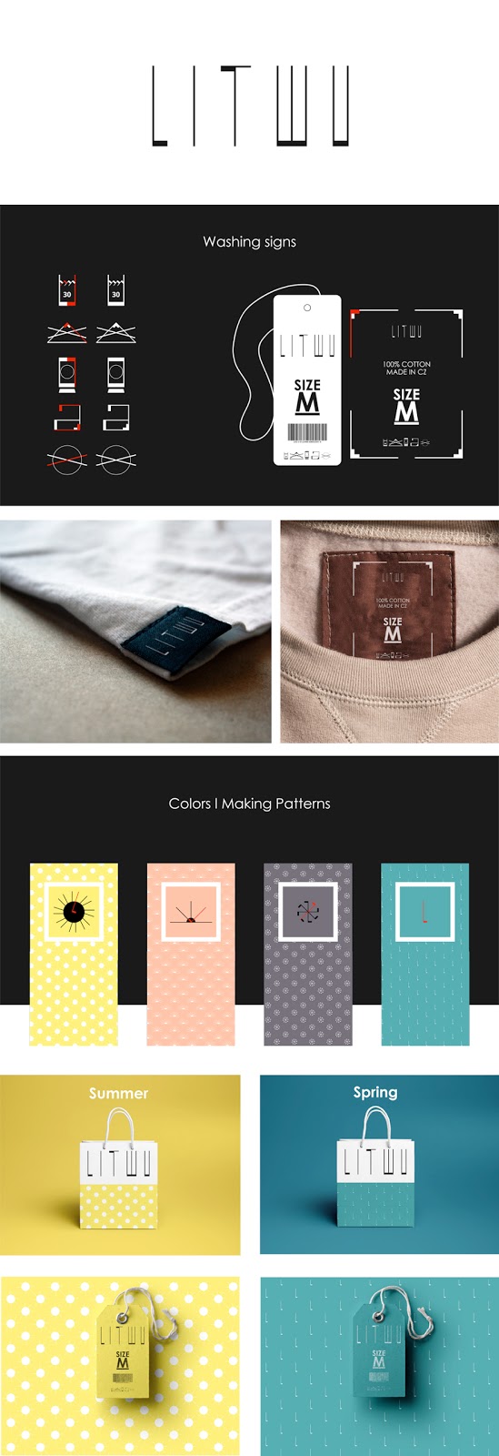
In his work Anton Bugaev created logo that visually reflects the thread, and thin versus thick parts of sewing. Based on the custom letters he constructed washing symbols as well as decorative patterns representing seasonal mood. Together it creates good visual consistency. |
Litwu by Anton Bugaev |
Love is the way up approach
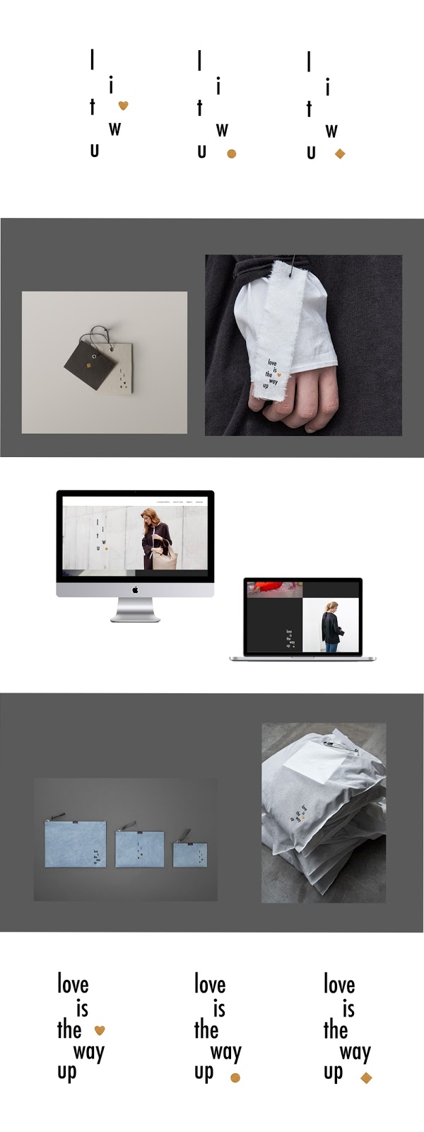
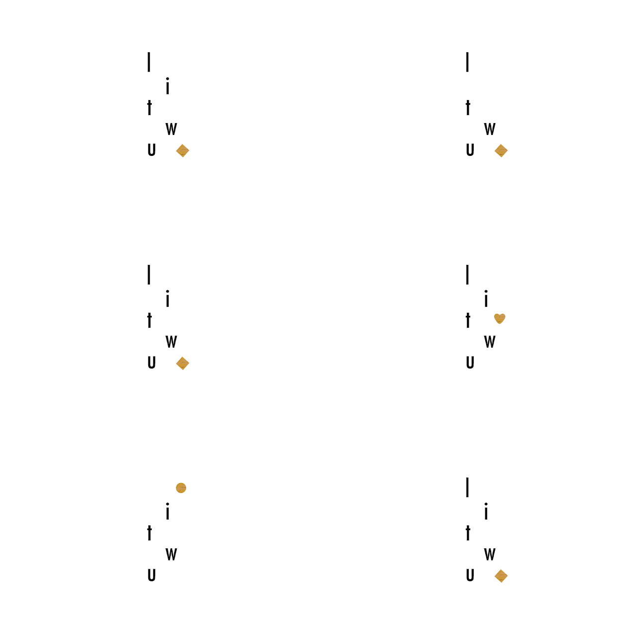
Some students created a solution that suits Litwu brand and its requirements conceptually. The visual treatment highlights typical attributes of Litwu rather than emphasising fashion industry itself. Their beauty lies in simplicity while standing away from being boring.The concept by Maggie Jandova allows the self interpretation of love by leaving a space to be filled accordingly. Love is... the way up, the feeling, passion etc. It corresponds with the brand's focus on woman in her diverse everyday life situations.
 |
Litwu by Maggie Jandova |
The shape shows life with ups and downs in it, but tend to always go up in the end.
 |
| Litwu by Almira Yausheva |
Since Litwu brand focuses on female fashion mainly, Iva Borisova built her concept around a vertical line representing female body. The additional playful shapes show diversity. They are however kept within a certain frame which points out that the company's high standards are about to remain stable.
 |
| Litwu by Iva Borisova |
 |
| Litwu animation by Iva Borisova |
Fashion in the air
As opposed to the three above listed examples the following ones show clearer connection to the fashion industry. They still represent Litwu company by considering and incorporating some of its key values into the design.The visual solution of Aidana Dzhumagulova reflects the main paraphrase of Litwu in interpretation of the shape: the top part of the logo is open which means all the ways up are free. It also communicates the described path of a woman in its classical but contemporary atmosphere that is highlighted by the perfection for quality, lines and colour palette.
 |
Litwu by Aidana Dzhumagulova |
Ain Rahmanova worked with another element typical for fashion brand - a needle, designed in customised handwritten manner. The symbol is connected with Litwu by its minimalism, neatness and representation of individual approach - to the clothes design as well as to its customers.
 |
Litwu by Ain Rahmanova |
The last shown work is by Daniel Dreyer who created the logotype based on sewing stitches. Keeping the colour palette and whole visual language minimalistic fits with Litwu brand characteristics and requirements.
 |
Litwu by Daniel Dreyer |
In conclusion
Litwu brand is a real client the students worked with within this project. I believe the company received suitable solutions they can further work with and consider as their new corporate identity. Once the client's choice is made I'll be happy to announce the selection here.
Situs Judi Casino Bola Online Uang Asli - FilmFileEurope
ReplyDeleteCasino Online Uang Asli. Bola Online 일문공 주소 Uang Asli. Bola Online Uang Asli. Bola 토토사이트 시스템배팅 샤오미 Online 사설토토 운영 샤오미 Uang Asli. Bola Online Uang Asli. Bola 가입시 꽁 머니 사이트 Online Uang Asli. Situs Judi 파워볼 돈버는법 벳무브
Paradise Casino Walkerhill is the most effective on line casino in Seoul by far and most closely resembles a Las Vegas or Western on line casino experience. As I detail beneath, despite the Korean government’s desperate measures to 빅카지노 stem gambling here, might be} NO stopping Koreans from gambling. Paradise City in Incheon is the first of three built-in resorts to open outside Seoul. MGE, which missed out on an opportunity to have a resort in Greece in favor of South Korea, continues to advance its project. It recently mentioned that the $1.6-billion property, Inspire Entertainment Resort, is overcoming COVID-19-induced delays to continue development. There are 10 cities with gambling services in South Korea which have 32 legal gambling services out there in whole.
ReplyDeleteYourr the best
ReplyDelete