06/06/2017

UX research ain't boring

Corporate Identity class at Prague College brought another live project for my students, being at the beginning of their second year of studies. Short assignment for just few weeks required creation of small corporate identity for UX freelance designer. Jules MUIJSERS and his work has been selected by the client and will be implemented in use. Here is an interview with Jules focusing on his creative process. At the end you can find solutions from other two students which I found conceptually interesting and worth sharing. Enjoy!

Congratulations, Jules! Can you briefly introduce the client and the project requirements?


David Szabó is a freelancer, working as User Experience designer and researcher. He needed a visual identity that would work on print and digital. The specific requirements were: logo, business card, presentation for conferences/speaking, video presentations (vlogs), and a website.

Have you worked on such complex corporate identity project before?


No. I’m not really that much of a corporate designer. Sometimes I make identities for music artists, or events. But something as complex as this I’m not really that experienced with.

What did you start your creative process with?


As with most of my projects I started with research. So that I would get an overview of the identities from the competitors. But also understand David's profession better. This was quite limited in this case. As in user experience profession people usually work as part of a company, and not freelance. But it’s what made this project unique and an opportunity to do something different.

What were the next steps?


After the research I proceeded to sketching. Usually I start by loosely sketching a bunch of ideas in my sketchbook, and later I select the ones that I will digitize. In between this step, I draw the logo on a grid, which I print out and sketch on (printfreegraphpaper.com). This is to clean up my design, and use geometry as an aid, as for our eyes it’s more pleasant when something is consistent, and the grid helps with this.

Corporate identity for David Szabo - hand sketching by Jules Muijsers


While sketching I felt an “aha” moment with one specific sketch. But to not just assume on the good feeling I had about it I still developed all of the sketches digitally.


Corporate identity for David Szabo - digital sketching by Jules Muijsers


The creative brief included the client's brand strategy with the Explorer archetype defined. Did you consider this aspect when creating the visual solution? If yes, how is it reflected in your visual identity proposal?


I had a look at the archetype in the brief, and tried to keep this in mind while sketching. Also from meeting the client and taking notes I got a good feeling of the client’s character and kept this in mind during the process, so that it would fit to him. So I definitely considered this aspect. An Explorer takes certain paths, and makes it easier for others to “explore” the same (as David does as an UX freelancer). Explorers find a way to somewhere, think about Colombus for example. So in this way I think the visual metaphor is very strongly reflected in my eventual design, by being a path and leading somewhere. David helps his clients finding a certain path to go, based on his research and findings.

From the variety of ideas you came up with what made you to pick the final solution?


From the three concepts I developed it was actually quite easy to make a final decision. Personally for me I felt two of them were strong, but one of them was rather corporate, and wouldn’t have the same strength as my final chosen one, which would help David to have a personal identity that reflects him.

Does the logo mean anything? Is it based on some concept / what is the idea behind?


David creates a certain path for his clients, based on his research. His clients have a certain UX related problem and trough research and findings he develops a path to help making the process perfect. The logo reflects this path, and David as an explorer. The shape also forms his initials - DS.


Corporate identity for David Szabo - final logo by Jules Muijsers


How did you proceed with the typeface selection?


As the logo is based on an isometric grid, the typeface had to fit to the forms of the logo. Typefaces are often based on certain categories of “style”, and as David is an UX designer, a more technical typeface made sense. I always try to have a variety of options and print out, so that I can have a better look at how it looks on paper.

Did you face any difficulties during your creative process?


I didn’t really face any major difficulties along the way. Only the typeface selection I wasn’t too sure about the weight of it, which I eventually changed to better fit the thickness of logo. Maybe I created too many options for myself that it was hard to make a decision. Also I made some adjustments adding a bit more white space, so that the logo wouldn’t lose detail in a smaller size, as gaps that are near each other usually tend to get closer together for the eye.

The client came for an interim presentation to the class. Were you satisfied with his reaction and feedback to your work?


As we did the presentation in front of the full class I felt it was harder for the client to give feedback, as everybody could hear it – it may be harder to speak about preferences. So the immediate feedback was quite limited, but the feedback provided later by email gave me the feeling the client liked my solution.

What did you find most interesting on this project?


Creating an identity like this is quite unique; it resembles a person and not an entity or big company. Which actually gives a lot of possibilities into creating something new, that is not out there yet, as there are not many people in the Czech Republic that do what David does.

Are you happy with your work? Would you change anything on it now?


I’m definitely happy with my work, from sketching one specific logo I already felt good about, and then it was great that when it has been developed it was actually the one that got chosen. I still have to discuss with the client what changes have to be made, but there is a competitor that has a very similar colour coding – so this is something that has to be changed.

The client picked your solution as the most suitable one for himself. How do you feel about it?


I’m really glad at it. Especially because I’m not that experienced in creating corporate identities, it feels really good to have created a suitable solution for the client. Also it’s nice to see something come alive and really be used.

Corporate identity for David Szabo - finals by Jules Muijsers


The other two interesting solutions


Here are other solutions from two students that I found conceptually interesting. The first is by Martina Drobná. Since the client's surname Szabó means a tailor she built her concept on tailor-made UX research and solutions for his clients. Simple dashed lines carry the meaning of being in the process, while the full lines represent the solution.

Corporate identity for David Szabo by Martina Drobna


The design by Šimon Rico comes out of the client's typical working process illustrated by a spiral. Since every UX research requirement is different, Šimon produced rather dynamic identity, that can change and represent variability of David Szabó's approaches.

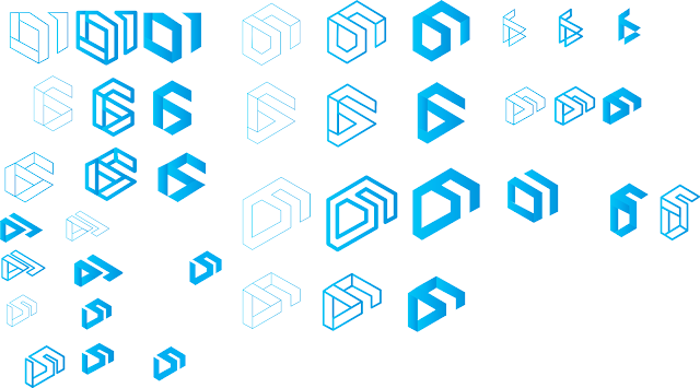
Corporate identity for David Szabo by Simon Rico


26/05/2017

She Spoke to me

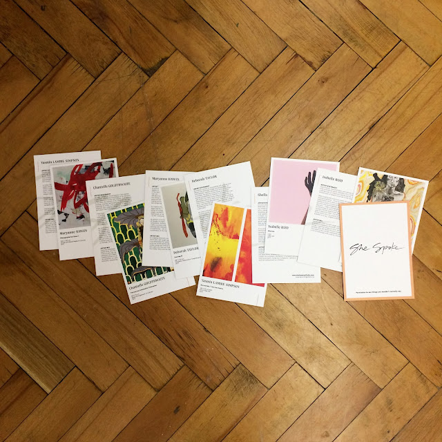
Today I woke up with an incredible feeling running through the whole existence of myself. The experience of last night happening persisted; evoking sensation of power. She Spoke was a special, one-night art event designed to create connections between art, artist and audience. Six female artists came from all over the world to exhibit their fantastic pieces of work. Far away from any typical opening or vernissage. Far away from the usual.

The conversations based on direct and thoughtful questions were the key to mutual understanding. The artists made me think of what I looked at in different and in depth way. Yes, the artists, not only the art itself. The intimate discussion with each of the artist herself let me understand her thinking, her creative process, what the art represents and how it actually came to life. Was the creation spontaneous or conceptual? Is it free or bound? Is the art and its creator vulnerable or confident? Is the approach traditional, free-form or unconventional? What were her emotions then, and what are my emotions now? How does she feel and how do I feel?

The point of sharing this is not to bring you the answers. Because my answers would be mediated. And that's exactly what this carefully designed event avoided, to let everyone connect in his/her own way. So the point is to celebrate the event itself. To celebrate we can experience art through direct and long conversation with the artist about it. Or about something else that joins her with her creation, her life, her experience. What inspires her. How it will inspire me later on... And lastly to celebrate the artists being given a great opportunity for direct opinions, feelings and emotions their work raise in the audience.

Becoming Artists Art Movement founded and led by Jessica Serran, made the She Spoke event happen. And I am very grateful I experienced it. Thank you, Maryanne Hawes, Isabelle Rizo, Yasmin Lambie-Simpson, Deborah Taylor, Sheila Metcalf Tobin, and Chantelle Goldthwaite, that magical powerful feeling still persist in me.

She Spoke catalogue I had an honour to design.

She Spoke catalogue I had an honour to design.

She Spoke catalogue I had an honour to design.


26/04/2017

And the winner is...

Some time ago I posted an article featuring my students' works for Litwu fashion brand. The company found several solutions attractive and functional, and they have chosen the work of Maggie Jandova as their new corporate identity. Here I bring an interview with the creators of three most liked designs. Congratulations to all!

1. Maggie Jandova


2. Almira Yausheva


3. Iva Borisova


Q: Did you work on such complex corporate identity project before?


Maggie: No, this was the first time, but I believe that we were all prepared for it; there were already two assignments connected to brand design in our first and third semester and actually these were the ones that I enjoyed the most.

Almira: No, it was my first experience. I am still a student, who doesn't face real clients yet. Sometimes we had assignments to create our own brand and corporate identity for it, but working with client's brief feels very different.

Iva: This was my first complex corporate identity project and I am happy I was able to make such a complex and original CID. I really like the simplicity and playfulness of it.

Q: What was your process until you came to your final idea?


Maggie: After research I made many sketches, which unfortunately didn’t look so good on the screen as I expected. I knew I want to play with abstract geometric shapes, but I didn’t know how to fit them in the concept, I didn’t want it to be just a random decision. We had to present three concepts at one point, but I wasn’t satisfied with the ones that I had so I had to come up with something else. I started to think about the slogan “love is the way up” and how to represent it and the final idea maybe came a bit from nowhere, but I thought that I would not describe love like that. From that I developed my concept in which the lines allow own interpretation of the slogan.

Almira: My process started as usual with some research and sketching, but when I got the digital stage, I felt a bit lost. My sketches didn't look that great in digital world, so I was looking for new concepts and techniques. For my final idea initially, I planned to have my identity more dynamic and change shape of logo and/or typeface, but it didn't work out.

Iva: First, as usual, I did really wide research and analysis of the client, their philosophy, values and desired visual identity. I really enjoyed the process itself and somehow I felt in love with it.

Q: Why did you pick the final solution? What made you think it is the best one?


Maggie: I wanted to have a strong concept which has various options how to work with it through out the whole identity. This one was the best for its design - simple, elegant, airy but also for its variability in applications; the logo can be used with or without the slogan, the slogan itself can say different interpretations of “love is” when used with photos and the lines can work to underline certain information related to the name of collection, collaborating designer, size of the clothing…

Almira: It was the most elegant and classy one out of other options. Also it communicates good concept and has universal visual element: line.

Iva: I had two concepts that I really liked and in my opinion, both could work very well. The final one was more original and different than everything I have had seen before and I think this was crucial for my decision.

Q: What did you find the most difficult / challenging on this project and/or during your creative process?


Maggie: For me the most difficult part is always creating the concepts and deciding on the final logo, because everything is than based on it. I am a perfectionist and critic of my own works so if I feel that the logo or concept is not good enough I can’t work with it; I would not enjoy it and I would not want to present myself with something like that.

Almira: For me the most difficult part was to come out with nice concepts and execute them digitally. But after I found a final shape, everything became easy.

Iva: Surprisingly I didn't experience any difficulties during the creative process but on the final stage was a really big challenge for me to fix all small technical details. Because of the complexity of the logo itself was really hard to specify each place strictly and to make it as balanced as possible.
First difficulties I faced were with the woman body shape that I used for the logotype itself, the space between letters and the form of the logo. The second was the small golden shapes, that appear in a different place and have a different form so they change the logotype visually every time. This was hard, to make it balanced, simple, dynamic but at the same time not heavy for the viewer. Also, I used the abbreviation and the full name of the brand for my logo proposals and I was working on so many different logos at the same time which was also one complication.

Q: And how did you solve it?


Maggie: I came up with a solution which I love and I’m proud of.

Almira: I was sketching, sketching and sketching. Experimentation and multiple tries are always the way to solve design problems.

Iva: I just was looking for the way how to unify and simplify it when I worked on my brand book. I still think I was not very successful on the final stage, the presentation of the logo itself on all applications and this is something that can be improved.

Q: Did you follow work of other students? Did you consider their work as inspiration or rather a competition?


Maggie: I am a competitive person so I always take my classmates as a competition even when we have projects which don’t involve clients, however I am always curious what they come up with.

Almira: I really enjoy to look at others works, because we all have different ideas and tastes. I can't say that I take their works as inspiration or competition, but I think that sharing is an important part of creative process. I like to feel as a part of community and discuss project together. For me communication between designers is a key part of university life, because we all share skills and thoughts, which make us all grow in professional field.

Iva: I always follow the work of my classmates and it helps me to see where I am. Also, I always want to hear my colleagues opinion, because it helps me to see my mistakes and to look at my work from a different point of view. I always follow their work and process and use it as inspiration.

Q: Was a good grade the only motivation for you in this project?


Maggie: Rather than the grade my motivation was to create a beautiful and functional design, which would suit the client and which both they and I will enjoy and love.

Almira: Not going to lie, I am a very competitive person. Also, I am a perfectionist, so I don't allow myself to deliver work on a low level. I can't say that a grade is my main goal, but it's a good reward after weeks of hard work.

Iva: No. Maybe its not good to say this but in general, I don't care that much about grades. I really enjoy the process itself, and I appreciate so much the objective and critical feedback we received from out tutor because this is the only way how I can get better. My motivation was big and I had such a perfect symbiosis with Litwu from the beginning.

Q: Would you change anything on the corporate identity class structure? (for example was there enough feedback and communication with the client? Was there enough time for everything?)


Maggie: I believe that the structure was appropriate to the project.

Almira: I would say, I want to have more opportunities to look into others works and discuss in round table. Personal feedback is important, but few whole group discussions will be helpful as well.

Iva: In general, I think the corporate identity class is very well structured and I did not face problems with the time that was dedicated to the projects in general. As I already mentioned I really like the way how we discussed our work and received feedback. Also in my opinion feedback was always very objective, honest and helpful.

Q: Is there anything you would improve or change on your work, having now couple of months distance from it?


Maggie: Only thing I would probably change would be the secondary colours, which I need to discuss further with the client.

Almira: For some reason, when I look at my logo, it feels a bit imbalanced, but I can't say how to change it, without ruining my concept. Also, I wish I had chance to plan photoshoot according to my graphic design style and make my own pictures of the brand in the style. We had some limitations, because photos were already provided, but if not I would think about guidelines for photoshoot and maybe implement line as a physical object on a stage.

Iva: I would definitely work a bit more on my applications and I am sure I can represent my logo in a more professional way. I think this was my weak part. Also, there is always space for improvement, I know that I can make it better in terms of small, very small details on the logo itself as well.

Q: Maggie, as a winner, are you going to further cooperate with the client?


Maggie: I will and I am really excited that they chose my design to represent them.

15/03/2017

Behave accordingly!

Designers have power to change. To change our minds, opinions and judgement. Do they also have the power to change people's behaviour? 

Within the past semester a group of my 1st year HND students at Prague college worked on assignment called Behaviour. Their task was to choose a public space or environment where people gather and possibly also interact with each other. By their design or interventions in the selected place the students were supposed to change the people's behaviour (in a positive way). In real life such task would require more time and lots of testing especially when trying to break the ingrained habits or routine. This project was rather supposed to make the students aware of the design power and to encourage them to step away from traditional graphic design and observe the environment we live in. The brief was completely open and the students didn't fail to demonstrate their creative thinking. I was happy to see the diversity of approaches and various results - from fun encouraging idea to practical solutions to conceptual answer.

Martina Drobna found her late evening commuting quite annoying especially when waiting on the station for a long time. She observed that also other co-waiting people look rather bored. So she came up with an entertaining idea. Turn the flashlight on your phone and become an artist, or simply answer the question the drawing board offers. At the end, share your temporary creation on social media. Fun, isn't it?
Behaviour by Martina Drobna

Behaviour by Martina Drobna


Simon Rico uses one of the Prague's busiest metro stations on daily basis. Several entrances and exits in various directions cause lots of collision. In the narrow corridor it brings the travellers rather unpleasant experience. Simon came up with an idea to leave some paths only for exits and some only for entrances. The final solution would require the commuters to be disciplined but could indeed save time and avoid jamming with others.
Behaviour by Simon Rico

Behaviour by Simon Rico


Jakub Vosecky decided to combine tidiness with fun and a bit of education. He picked Prague's district Letna which was known because of the massive Stalin's Monument (between years 1955 - 1962) - the world's largest representation statue of Joseph Stalin. Nowadays the remaining statue's pedestal is a popular place for skateboarders which directed Jakub's idea as well as his outcome's visual style. The aim to keep the area clean and to remind the history allowed for Stalbin to be created.
Behaviour by Jakub Vosecky

Behaviour by Jakub Vosecky


Jules Muijsers wanted to deliver a deeper message regarding life and time. He observed that people barely notice the surroundings while rushing through the streets. So he decided to stop them and make them think about themselves in terms of how they spend their time and life. His installation shows four different types of persons based on various approaches to time. The used material - thread - demonstrates connection to life. You can see life as a thread - sometimes hanging on one thin line only.

Behaviour by Jules Muijsers

Behaviour by Jules Muijsers


In conclusion

This behaviour changing task can be approached from any perspective. I'd be interested to see the above selected suggestions in real life and how they would stand the testing. All of them have potential to work with changing the habits, some with immediate visible effect and measurable results. At the end here is an interesting experiment on how unexpectedly easy it can sometimes be.

13/03/2017

All about love

What is it I love about teaching? Apart from being constantly filled with creative energy, inspiration and motivation, it is mostly the diversity. Diversity of other designers thinking, their approaches, and outcomes. 

Last semester I gave to my students at Prague college a task to create corporate identity for a fashion brand. With previous experience of creating small visual identity only, for most of them this was their first broader project of such kind. As a designer I believe that corporate identities shouldn't be only functionally and aesthetically correct but should also carry deeper thought and be built on an interesting idea. My students' works shown below reflect this attitude. In some of them I love certain details, in some the complex approach, in others it is the way they look like - extraordinary, fighting nowadays trend of boring logotypes that all tend to look the same.

From the brief

The brand, called Love is the way up (or Litwu as they like to use) is a start-up company being shielded by its own fashion designer Marcela Krizova, and hence it provides and keeps its own style and taste. The company aims for smart, independent female audience between 30 - 50 years, with love towards high quality, design, attention to detail but appreciating minimalism at the same time. Litwu likes to give their customers a dress suitable for any occasion, be it a business meeting, dinner with the beloved ones or a friend's vernissage. Love is the way up is a paraphrase of Platonic love and life experience. It is a path in the life of a woman to herself. A path of finding and expressing her physical and mental uniqueness through her clothes and high quality design. It is a path towards love. And love is the way up.

Pictogram out of typography

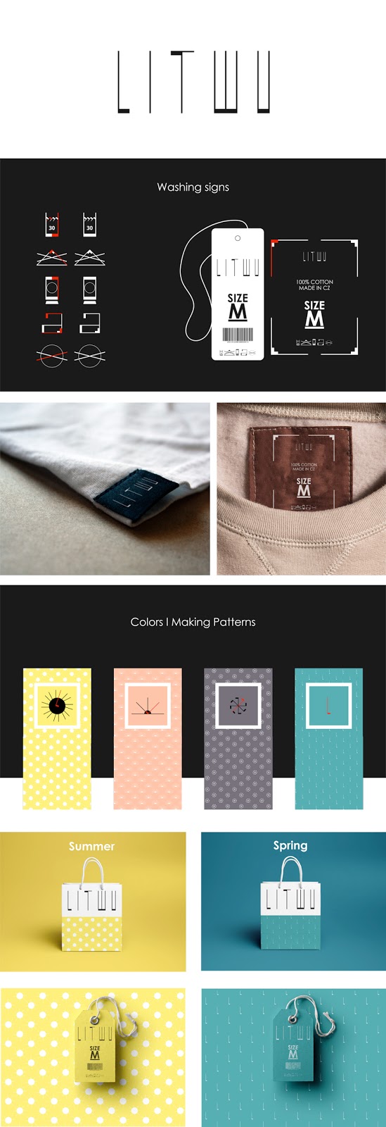
In his work Anton Bugaev created logo that visually reflects the thread, and thin versus thick parts of sewing. Based on the custom letters he constructed washing symbols as well as decorative patterns representing seasonal mood. Together it creates good visual consistency.
litwu - Anton Bugaev

Litwu by Anton Bugaev

Love is the way up approach

Some students created a solution that suits Litwu brand and its requirements conceptually. The visual treatment highlights typical attributes of Litwu rather than emphasising fashion industry itself. Their beauty lies in simplicity while standing away from being boring.

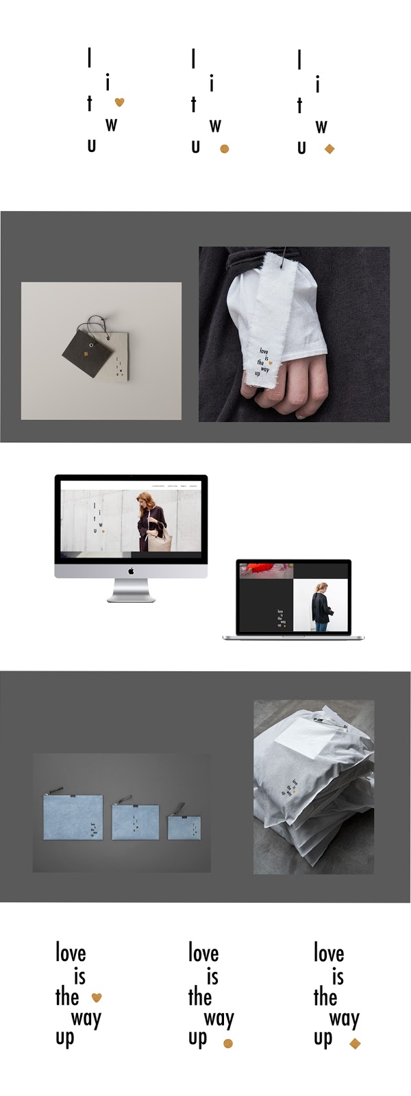
The concept by Maggie Jandova allows the self interpretation of love by leaving a space to be filled accordingly. Love is... the way up, the feeling, passion etc. It corresponds with the brand's focus on woman in her diverse everyday life situations.

litwu - Maggie Jandova

Litwu by Maggie Jandova


Almira Yausheva explored the line as a simple and functional symbol representing connections: woman and love, brand and customer, different collaborations between designers.
The shape shows life with ups and downs in it, but tend to always go up in the end.
litwu - Almira Yausheva
Litwu by Almira Yausheva


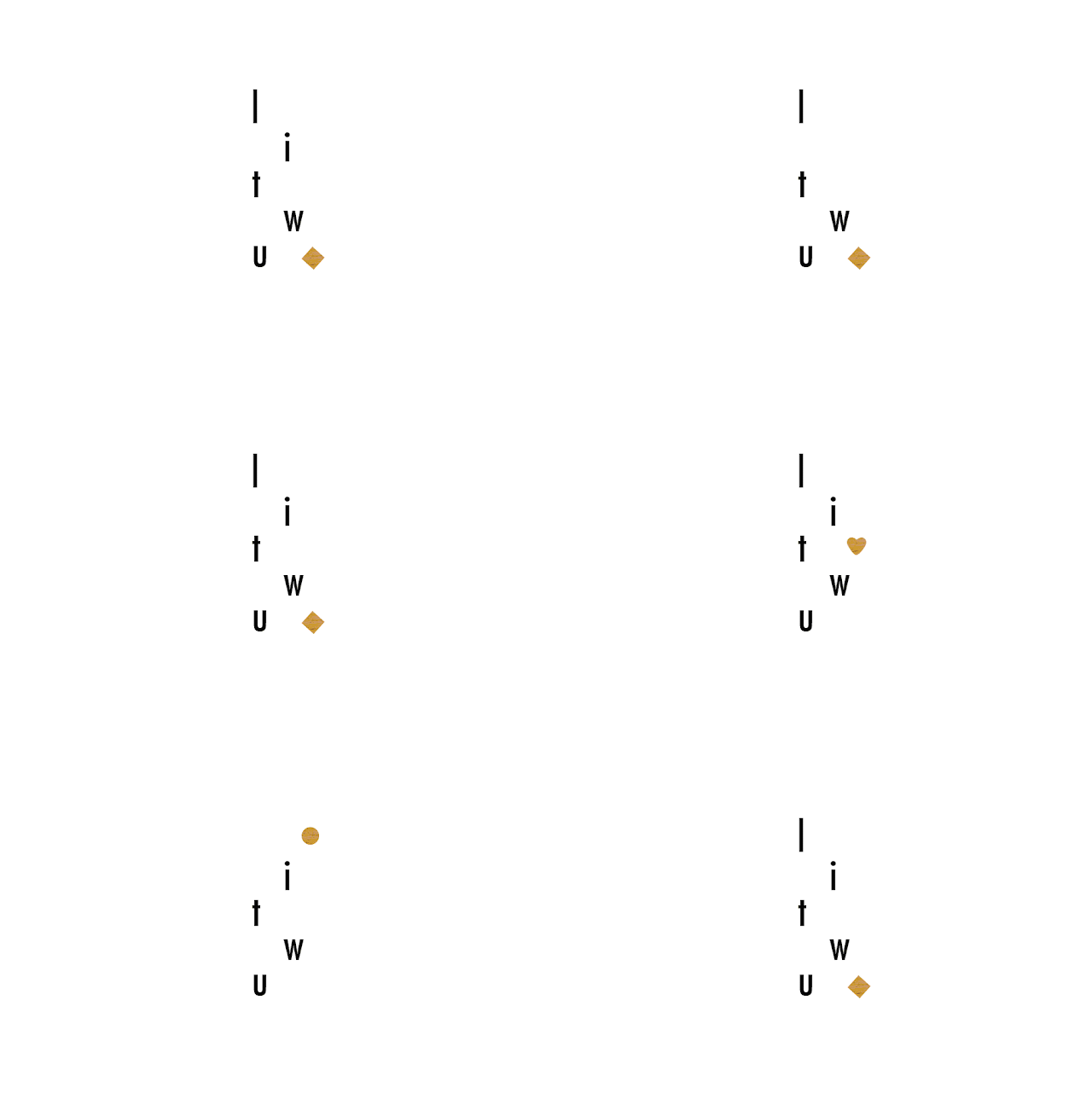
Since Litwu brand focuses on female fashion mainly, Iva Borisova built her concept around a vertical line representing female body. The additional playful shapes show diversity. They are however kept within a certain frame which points out that the company's high standards are about to remain stable.
litwu - Iva Borisova
Litwu by Iva Borisova

litwu - Iva Borisova
Litwu animation by Iva Borisova


Fashion in the air

As opposed to the three above listed examples the following ones show clearer connection to the fashion industry. They still represent Litwu company by considering and incorporating some of its key values into the design.

The visual solution of Aidana Dzhumagulova reflects the main paraphrase of Litwu in interpretation of the shape: the top part of the logo is open which means all the ways up are free. It also communicates the described path of a woman in its classical but contemporary atmosphere that is highlighted by the perfection for quality, lines and colour palette.

litwu - Aidana Dzhumagulova

Litwu by Aidana Dzhumagulova


Ain Rahmanova worked with another element typical for fashion brand - a needle, designed in customised handwritten manner. The symbol is connected with Litwu by its minimalism, neatness and representation of individual approach - to the clothes design as well as to its customers.

litwu - Ain Rahmanova

Litwu by Ain Rahmanova


The last shown work is by Daniel Dreyer who created the logotype based on sewing stitches. Keeping the colour palette and whole visual language minimalistic fits with Litwu brand characteristics and requirements.
litwu - Daniel Dreyer

Litwu by Daniel Dreyer


In conclusion


Litwu brand is a real client the students worked with within this project. I believe the company received suitable solutions they can further work with and consider as their new corporate identity. Once the client's choice is made I'll be happy to announce the selection here.