Showing posts with label education. Show all posts

06/06/2017

UX research ain't boring

Corporate Identity class at Prague College brought another live project for my students, being at the beginning of their second year of studies. Short assignment for just few weeks required creation of small corporate identity for UX freelance designer. Jules MUIJSERS and his work has been selected by the client and will be implemented in use. Here is an interview with Jules focusing on his creative process. At the end you can find solutions from other two students which I found conceptually interesting and worth sharing. Enjoy!

Congratulations, Jules! Can you briefly introduce the client and the project requirements?


David Szabó is a freelancer, working as User Experience designer and researcher. He needed a visual identity that would work on print and digital. The specific requirements were: logo, business card, presentation for conferences/speaking, video presentations (vlogs), and a website.

Have you worked on such complex corporate identity project before?


No. I’m not really that much of a corporate designer. Sometimes I make identities for music artists, or events. But something as complex as this I’m not really that experienced with.

What did you start your creative process with?


As with most of my projects I started with research. So that I would get an overview of the identities from the competitors. But also understand David's profession better. This was quite limited in this case. As in user experience profession people usually work as part of a company, and not freelance. But it’s what made this project unique and an opportunity to do something different.

What were the next steps?


After the research I proceeded to sketching. Usually I start by loosely sketching a bunch of ideas in my sketchbook, and later I select the ones that I will digitize. In between this step, I draw the logo on a grid, which I print out and sketch on (printfreegraphpaper.com). This is to clean up my design, and use geometry as an aid, as for our eyes it’s more pleasant when something is consistent, and the grid helps with this.

Corporate identity for David Szabo - hand sketching by Jules Muijsers


While sketching I felt an “aha” moment with one specific sketch. But to not just assume on the good feeling I had about it I still developed all of the sketches digitally.


Corporate identity for David Szabo - digital sketching by Jules Muijsers


The creative brief included the client's brand strategy with the Explorer archetype defined. Did you consider this aspect when creating the visual solution? If yes, how is it reflected in your visual identity proposal?


I had a look at the archetype in the brief, and tried to keep this in mind while sketching. Also from meeting the client and taking notes I got a good feeling of the client’s character and kept this in mind during the process, so that it would fit to him. So I definitely considered this aspect. An Explorer takes certain paths, and makes it easier for others to “explore” the same (as David does as an UX freelancer). Explorers find a way to somewhere, think about Colombus for example. So in this way I think the visual metaphor is very strongly reflected in my eventual design, by being a path and leading somewhere. David helps his clients finding a certain path to go, based on his research and findings.

From the variety of ideas you came up with what made you to pick the final solution?


From the three concepts I developed it was actually quite easy to make a final decision. Personally for me I felt two of them were strong, but one of them was rather corporate, and wouldn’t have the same strength as my final chosen one, which would help David to have a personal identity that reflects him.

Does the logo mean anything? Is it based on some concept / what is the idea behind?


David creates a certain path for his clients, based on his research. His clients have a certain UX related problem and trough research and findings he develops a path to help making the process perfect. The logo reflects this path, and David as an explorer. The shape also forms his initials - DS.


Corporate identity for David Szabo - final logo by Jules Muijsers


How did you proceed with the typeface selection?


As the logo is based on an isometric grid, the typeface had to fit to the forms of the logo. Typefaces are often based on certain categories of “style”, and as David is an UX designer, a more technical typeface made sense. I always try to have a variety of options and print out, so that I can have a better look at how it looks on paper.

Did you face any difficulties during your creative process?


I didn’t really face any major difficulties along the way. Only the typeface selection I wasn’t too sure about the weight of it, which I eventually changed to better fit the thickness of logo. Maybe I created too many options for myself that it was hard to make a decision. Also I made some adjustments adding a bit more white space, so that the logo wouldn’t lose detail in a smaller size, as gaps that are near each other usually tend to get closer together for the eye.

The client came for an interim presentation to the class. Were you satisfied with his reaction and feedback to your work?


As we did the presentation in front of the full class I felt it was harder for the client to give feedback, as everybody could hear it – it may be harder to speak about preferences. So the immediate feedback was quite limited, but the feedback provided later by email gave me the feeling the client liked my solution.

What did you find most interesting on this project?


Creating an identity like this is quite unique; it resembles a person and not an entity or big company. Which actually gives a lot of possibilities into creating something new, that is not out there yet, as there are not many people in the Czech Republic that do what David does.

Are you happy with your work? Would you change anything on it now?


I’m definitely happy with my work, from sketching one specific logo I already felt good about, and then it was great that when it has been developed it was actually the one that got chosen. I still have to discuss with the client what changes have to be made, but there is a competitor that has a very similar colour coding – so this is something that has to be changed.

The client picked your solution as the most suitable one for himself. How do you feel about it?


I’m really glad at it. Especially because I’m not that experienced in creating corporate identities, it feels really good to have created a suitable solution for the client. Also it’s nice to see something come alive and really be used.

Corporate identity for David Szabo - finals by Jules Muijsers


The other two interesting solutions


Here are other solutions from two students that I found conceptually interesting. The first is by Martina Drobná. Since the client's surname Szabó means a tailor she built her concept on tailor-made UX research and solutions for his clients. Simple dashed lines carry the meaning of being in the process, while the full lines represent the solution.

Corporate identity for David Szabo by Martina Drobna


The design by Šimon Rico comes out of the client's typical working process illustrated by a spiral. Since every UX research requirement is different, Šimon produced rather dynamic identity, that can change and represent variability of David Szabó's approaches.

Corporate identity for David Szabo by Simon Rico


26/04/2017

And the winner is...

Some time ago I posted an article featuring my students' works for Litwu fashion brand. The company found several solutions attractive and functional, and they have chosen the work of Maggie Jandova as their new corporate identity. Here I bring an interview with the creators of three most liked designs. Congratulations to all!

1. Maggie Jandova


2. Almira Yausheva


3. Iva Borisova


Q: Did you work on such complex corporate identity project before?


Maggie: No, this was the first time, but I believe that we were all prepared for it; there were already two assignments connected to brand design in our first and third semester and actually these were the ones that I enjoyed the most.

Almira: No, it was my first experience. I am still a student, who doesn't face real clients yet. Sometimes we had assignments to create our own brand and corporate identity for it, but working with client's brief feels very different.

Iva: This was my first complex corporate identity project and I am happy I was able to make such a complex and original CID. I really like the simplicity and playfulness of it.

Q: What was your process until you came to your final idea?


Maggie: After research I made many sketches, which unfortunately didn’t look so good on the screen as I expected. I knew I want to play with abstract geometric shapes, but I didn’t know how to fit them in the concept, I didn’t want it to be just a random decision. We had to present three concepts at one point, but I wasn’t satisfied with the ones that I had so I had to come up with something else. I started to think about the slogan “love is the way up” and how to represent it and the final idea maybe came a bit from nowhere, but I thought that I would not describe love like that. From that I developed my concept in which the lines allow own interpretation of the slogan.

Almira: My process started as usual with some research and sketching, but when I got the digital stage, I felt a bit lost. My sketches didn't look that great in digital world, so I was looking for new concepts and techniques. For my final idea initially, I planned to have my identity more dynamic and change shape of logo and/or typeface, but it didn't work out.

Iva: First, as usual, I did really wide research and analysis of the client, their philosophy, values and desired visual identity. I really enjoyed the process itself and somehow I felt in love with it.

Q: Why did you pick the final solution? What made you think it is the best one?


Maggie: I wanted to have a strong concept which has various options how to work with it through out the whole identity. This one was the best for its design - simple, elegant, airy but also for its variability in applications; the logo can be used with or without the slogan, the slogan itself can say different interpretations of “love is” when used with photos and the lines can work to underline certain information related to the name of collection, collaborating designer, size of the clothing…

Almira: It was the most elegant and classy one out of other options. Also it communicates good concept and has universal visual element: line.

Iva: I had two concepts that I really liked and in my opinion, both could work very well. The final one was more original and different than everything I have had seen before and I think this was crucial for my decision.

Q: What did you find the most difficult / challenging on this project and/or during your creative process?


Maggie: For me the most difficult part is always creating the concepts and deciding on the final logo, because everything is than based on it. I am a perfectionist and critic of my own works so if I feel that the logo or concept is not good enough I can’t work with it; I would not enjoy it and I would not want to present myself with something like that.

Almira: For me the most difficult part was to come out with nice concepts and execute them digitally. But after I found a final shape, everything became easy.

Iva: Surprisingly I didn't experience any difficulties during the creative process but on the final stage was a really big challenge for me to fix all small technical details. Because of the complexity of the logo itself was really hard to specify each place strictly and to make it as balanced as possible.
First difficulties I faced were with the woman body shape that I used for the logotype itself, the space between letters and the form of the logo. The second was the small golden shapes, that appear in a different place and have a different form so they change the logotype visually every time. This was hard, to make it balanced, simple, dynamic but at the same time not heavy for the viewer. Also, I used the abbreviation and the full name of the brand for my logo proposals and I was working on so many different logos at the same time which was also one complication.

Q: And how did you solve it?


Maggie: I came up with a solution which I love and I’m proud of.

Almira: I was sketching, sketching and sketching. Experimentation and multiple tries are always the way to solve design problems.

Iva: I just was looking for the way how to unify and simplify it when I worked on my brand book. I still think I was not very successful on the final stage, the presentation of the logo itself on all applications and this is something that can be improved.

Q: Did you follow work of other students? Did you consider their work as inspiration or rather a competition?


Maggie: I am a competitive person so I always take my classmates as a competition even when we have projects which don’t involve clients, however I am always curious what they come up with.

Almira: I really enjoy to look at others works, because we all have different ideas and tastes. I can't say that I take their works as inspiration or competition, but I think that sharing is an important part of creative process. I like to feel as a part of community and discuss project together. For me communication between designers is a key part of university life, because we all share skills and thoughts, which make us all grow in professional field.

Iva: I always follow the work of my classmates and it helps me to see where I am. Also, I always want to hear my colleagues opinion, because it helps me to see my mistakes and to look at my work from a different point of view. I always follow their work and process and use it as inspiration.

Q: Was a good grade the only motivation for you in this project?


Maggie: Rather than the grade my motivation was to create a beautiful and functional design, which would suit the client and which both they and I will enjoy and love.

Almira: Not going to lie, I am a very competitive person. Also, I am a perfectionist, so I don't allow myself to deliver work on a low level. I can't say that a grade is my main goal, but it's a good reward after weeks of hard work.

Iva: No. Maybe its not good to say this but in general, I don't care that much about grades. I really enjoy the process itself, and I appreciate so much the objective and critical feedback we received from out tutor because this is the only way how I can get better. My motivation was big and I had such a perfect symbiosis with Litwu from the beginning.

Q: Would you change anything on the corporate identity class structure? (for example was there enough feedback and communication with the client? Was there enough time for everything?)


Maggie: I believe that the structure was appropriate to the project.

Almira: I would say, I want to have more opportunities to look into others works and discuss in round table. Personal feedback is important, but few whole group discussions will be helpful as well.

Iva: In general, I think the corporate identity class is very well structured and I did not face problems with the time that was dedicated to the projects in general. As I already mentioned I really like the way how we discussed our work and received feedback. Also in my opinion feedback was always very objective, honest and helpful.

Q: Is there anything you would improve or change on your work, having now couple of months distance from it?


Maggie: Only thing I would probably change would be the secondary colours, which I need to discuss further with the client.

Almira: For some reason, when I look at my logo, it feels a bit imbalanced, but I can't say how to change it, without ruining my concept. Also, I wish I had chance to plan photoshoot according to my graphic design style and make my own pictures of the brand in the style. We had some limitations, because photos were already provided, but if not I would think about guidelines for photoshoot and maybe implement line as a physical object on a stage.

Iva: I would definitely work a bit more on my applications and I am sure I can represent my logo in a more professional way. I think this was my weak part. Also, there is always space for improvement, I know that I can make it better in terms of small, very small details on the logo itself as well.

Q: Maggie, as a winner, are you going to further cooperate with the client?


Maggie: I will and I am really excited that they chose my design to represent them.

13/10/2016

What do you do when you get stuck?

'What do you do when you get stuck?' was the opening question I asked our Prague College BA Graphic Design students on the experimentation workshop. The aim of this 4-hours lesson was to teach the designers how to get back to their creative process through random experimentation, as well as to encourage them to consider purposeful experiments as one of their working habit.

When designing this workhop I thought about those freakout moments and panic attacks designers have time to time because of getting stuck. I desperately wanted to evoke this feeling in my students at the beginning of the workshop in order to simulate real life situation. So I collected common, apparently uninteresting objects from various materials such as shoelace, plastic sachet, blank creased paper, sponge, wire, string, piece of cloth, straws etc. Each student was given only one object to work with.

collecting common objects

I succeeded. The students were surprised and uncertain of how they can creatively elaborate the object they received. On several examples of work from other designers as well as my own I showed few techniques emphasising hand-made approach. I stressed to carefully observe the material of their object, make connections, look for similarities, search for metaphors, play with it. The students could use their object as a tool for creating something new, or as a part of their design. They were allowed to (well ok, asked to) go wild!

Based on their diverse experiments the students had to come up with some social issue (recycling, waste, public transportation, social responsibility...) and address it through a small campaign, regardless the media. Including accident in the creative process is one of the ways how to approach some design solutions which the students tested within our workshop. They have also learnt they don't have to go far for ideas and inspiration, and can get unstuck by just 'playing' with an ordinary object.

Even though the workshop was focused on process rather than final result most of the students managed to end up with an outcome capable of explaining the concept and their thinking. I always encourage students to incorporate experimentation (either accidental or purposeful) as part of their creation. Because the results are worth it! Just have a look.

some of the workshop results

Zofia Ziakova, Bike more. Object: wire

Ieva Ozola, Home alone. Object: post-its

Ieva Ozola, Home. Object: post-its

Dora Ivanova, Light. Object: paper tube

Dora Ivanova, Equality. Object: paper tube

David Holzmann. Object: garlic mesh bag

Charlene Fournier. Object: plastic cup

Julie Klimentova. Object: transparent paper

Jana Krchova, Fading memories. Object: natural fibre

Rebecca Widera. Object: skewers

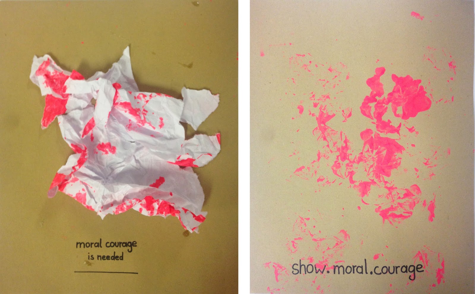
Stella Maria Ebner. Object: creased paper

Stella Maria Ebner. Object: creased paper

Elisabeth Mess. Object: string

David Nguyen. Object: shoelace

Ebenezer Animah. Object: plastic bag

Hubert Gaca, Internet. Object: wire


Laura Sophie Engeser, Violence. Object: straws

Zoe Mitterhuber, Philippines. Object: pieces of paper

Bianca Neumair, Save the sea. Object:aluminium foil

Mohini Mukherjee. Object: plastic bottle